How to Set Up an Email Sign Up on Your Website
For personal brands, I usually recommend either of these two email marketing service providers: ConvertKit and MailChimp.
They each have their strengths and only you can choose the right one for your needs. Both email marketing providers have been selected for their ease-of-use, affordability, and flexibility. Below my Pros and Cons for each, are specific instructions on how to set up an email sign up form on your website, based on your type of website.
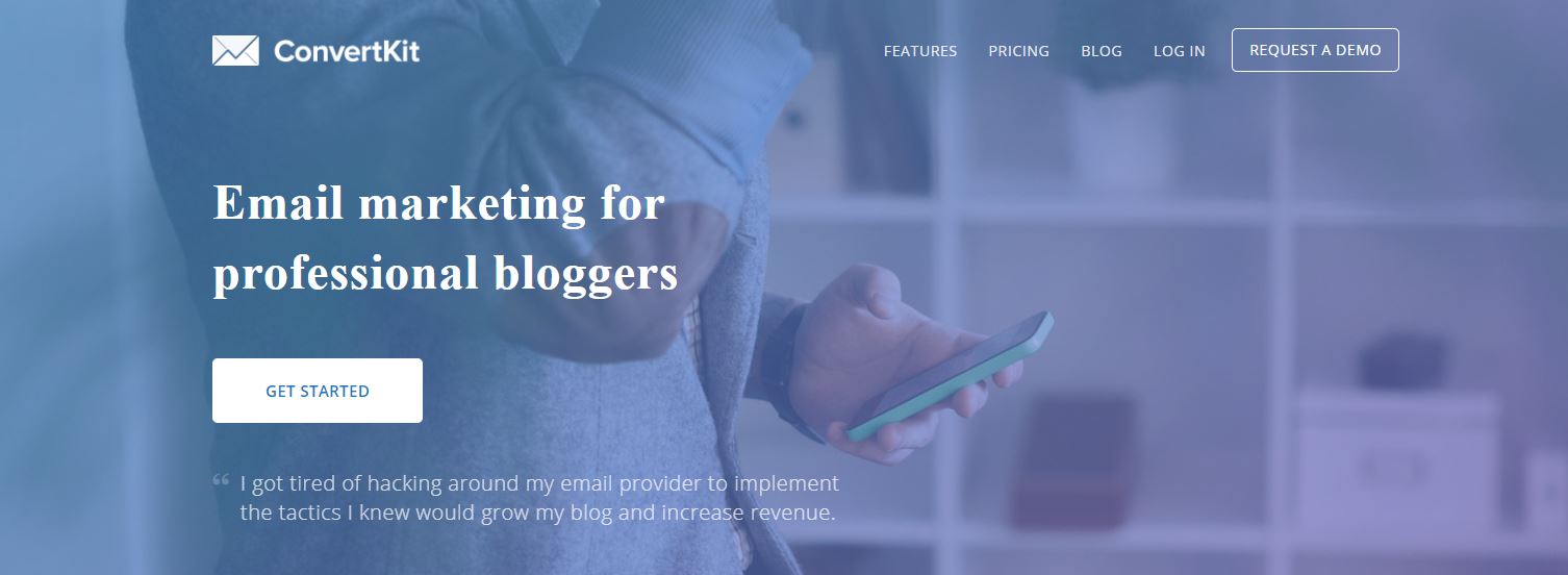
ConvertKit
I’m a bit newer to this provider, but I LOVE it’s capabilities for advanced marketing methods along with simplicity. I’m also a big fan of their company in general. Good people run this thing.
They say ConvertKit has the “power of Infusionsoft, but easier to use than MailChimp.” So far in my experience, that seems valid.

Pros:
- Easier to segment your list based on a subscriber’s actions, preferences, and purchases, so you can give people more of what they want (or need) and less of what they don’t
- Super easy to sign up and implement
- Great for automations–i.e. someone signs up for a freebie and then gets a series of useful emails after.
- Reasonable price
- Lots of integrations
- They have a wealth of knowledge on what actually works in email marketing and are proactive about helping you build your list.
Cons:
- They don’t have as many design options, and there’s no drag-and-drop layout designer
- There’s no free to start option
Now, if you are going with ConvertKit, here are instructions for how to set it up on your own site:
- Here’s how to set up your ConvertKit sign up form on your WordPress site.
- Here’s how to set up your form with your Squarespace site.
- And finally, you can even set up a ConvertKit form on Medium.
MailChimp
I switched to MailChimp from Constant Contact a few years ago when I felt like Constant Contact was trying to have too many bells and whistles while also becoming more corporate. Anywho, I really do like MailChimp’s drag-and-drop design, but there are a few things I don’t like so much–which may not matter to you when you’re just starting out. I recently began my migration from MailChimp to ConvertKit because I wanted to have a more complex way of catering to my subscribers needs.

Pros:
- Design options galore! Easy to do, too.
- Clean, modern user interface
- Easily integrated with many types of sites and platforms
- Good if you’re just starting out. Free to start and begin collecting email addresses
- I think they’re pretty cool people too–they loyally sponsored BinderCon
Cons:
- The user interface, while lovely is often counter intuitive. There’s definitely a big learning curve to understanding lists versus segments, versus groups or doing any kind of more advanced list segmenting.
- You cannot send your email to more than one list at a time.
- You can end up paying for duplicate subscribers (billing is based on number of subscribers) if you use more than one list, as they count them separately.
Now, if you are going with MailChimp, here are instructions for how to set it up on your own site:
- Here’s how to setup Mailchimp with your WordPress website.
- How to set it up on your Squarespace site.
Full disclosure: I am an affiliate for ConvertKit so I get a tiny commission if you purchase. (Thanks for your support). I currently use both email marketing platforms, but am migrating over to ConvertKit.


Trackbacks & Pingbacks
[…] go get your email list sign up set up if you don’t have one already (it shouldn’t take more than 30 minutes), and just jot down […]
Comments are closed.